Trajectory analysis of Myocardial Infarction using PILOT
Welcome to the PILOT Package Tutorial for scRNA Data!
Here we show the whole process for applying PILOT to scRNA data using Myocardial Infarction scRNA Data, you can download the Anndata (h5ad) file from here, and place it in the Datasets folder.
import PILOT as pl
import scanpy as sc
Reading Anndata
adata = sc.read_h5ad('Datasets/myocardial_infarction.h5ad')
Loading the required information and computing the Wasserstein distance:
Use the following parameters to configure PILOT for your analysis (Setting Parameters):
adata: Pass your loaded Anndata object to PILOT.
emb_matrix: Provide the name of the variable in the obsm level that holds the dimension reduction (PCA representation).
clusters_col: Specify the name of the column in the observation level of your Anndata that corresponds to cell types or clusters.
sample_col: Indicate the column name in the observation level of your Anndata that contains information about samples or patients.
status: Provide the column name that represents the status or disease (e.g., “control” or “case”).
pl.tl.wasserstein_distance(
    adata,
    emb_matrix = 'PCA',
    clusters_col = 'cell_subtype',
    sample_col = 'sampleID',
    status = 'Status',
    )
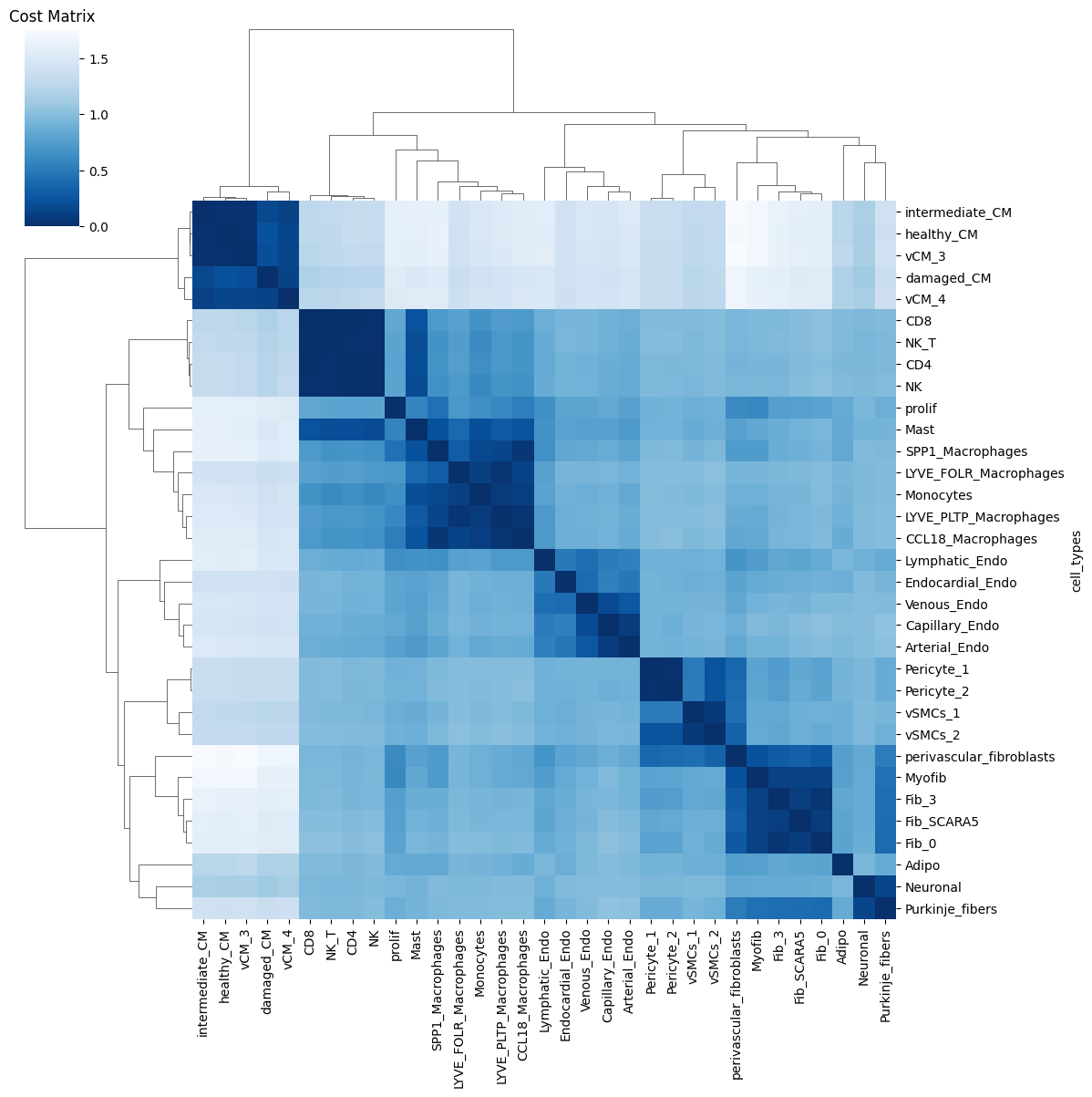
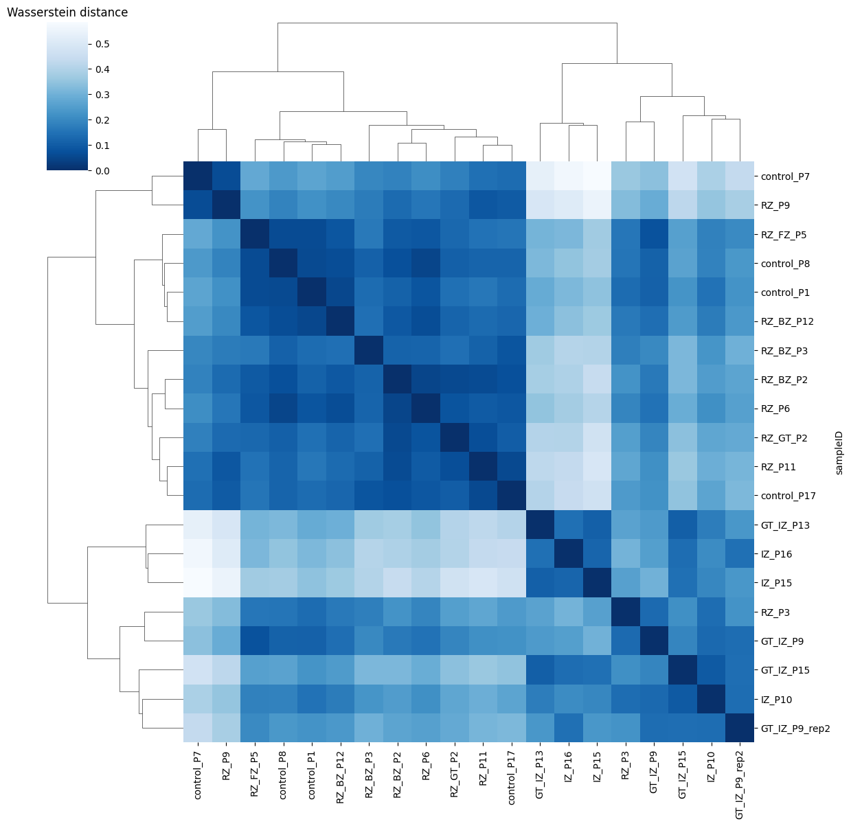
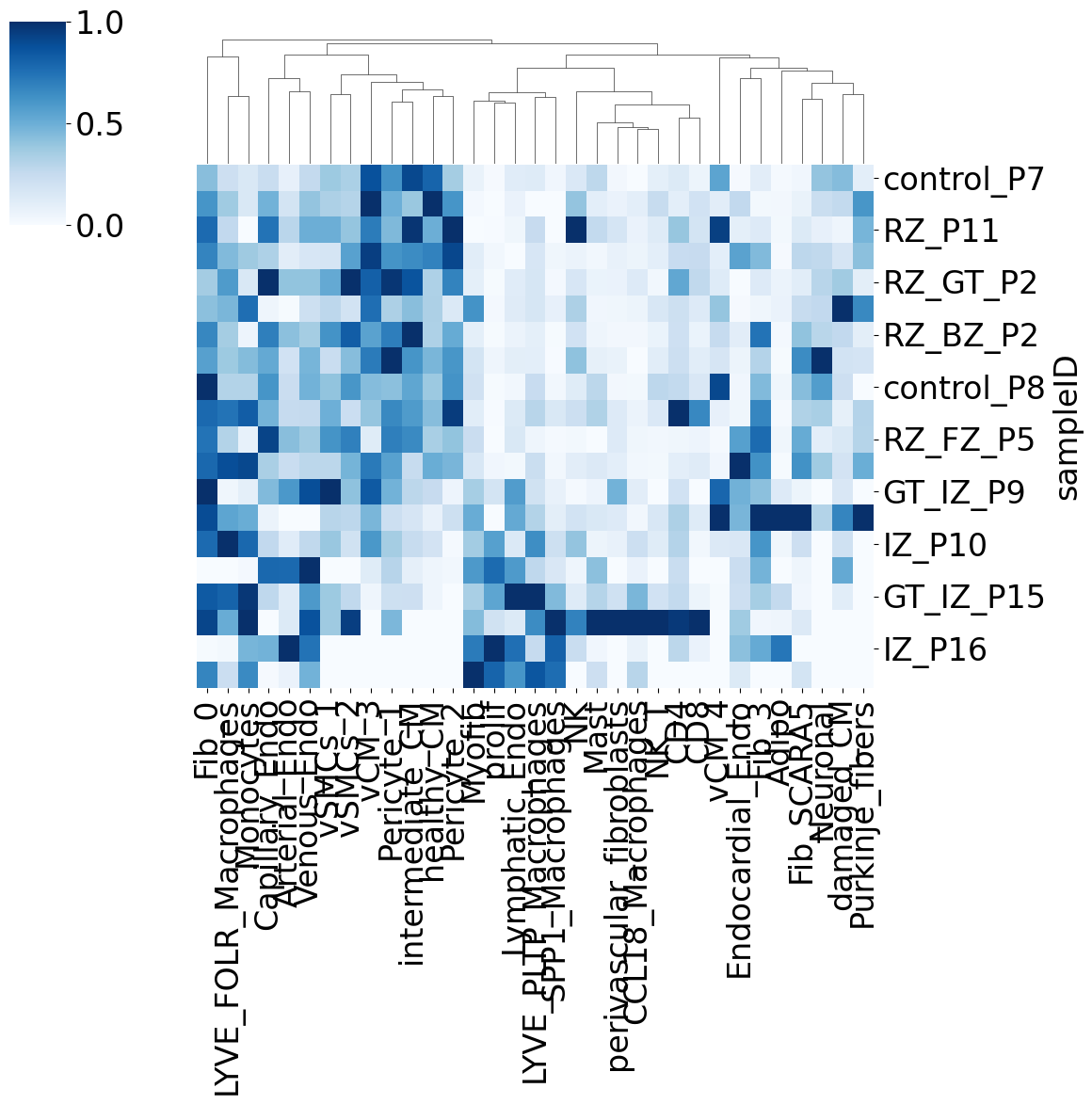
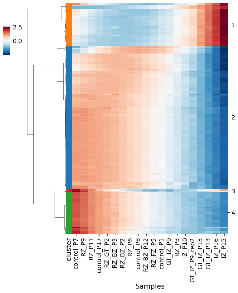
Ploting the Cost matrix and the Wasserstein distance:
pl.pl.heatmaps(adata)
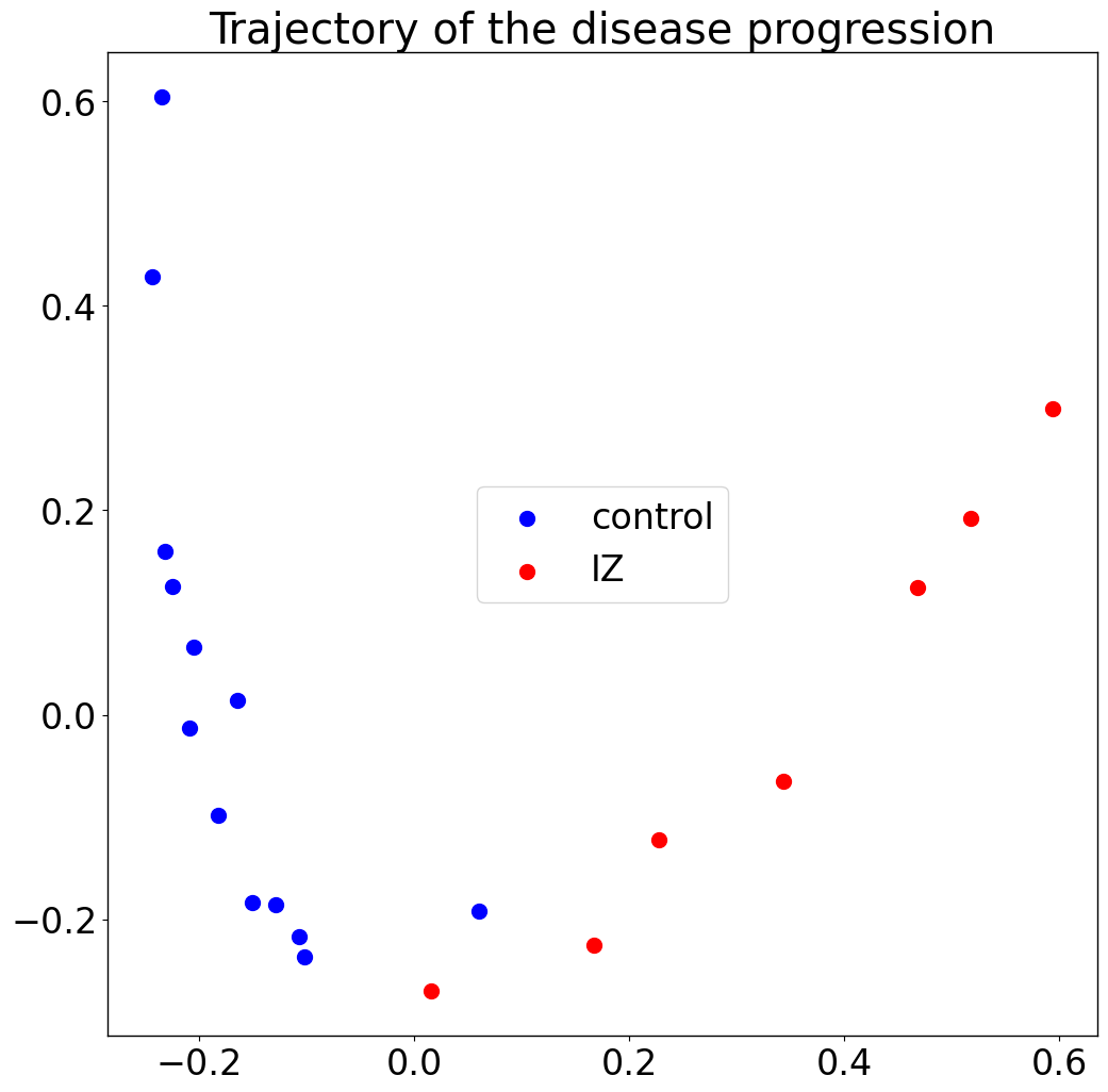
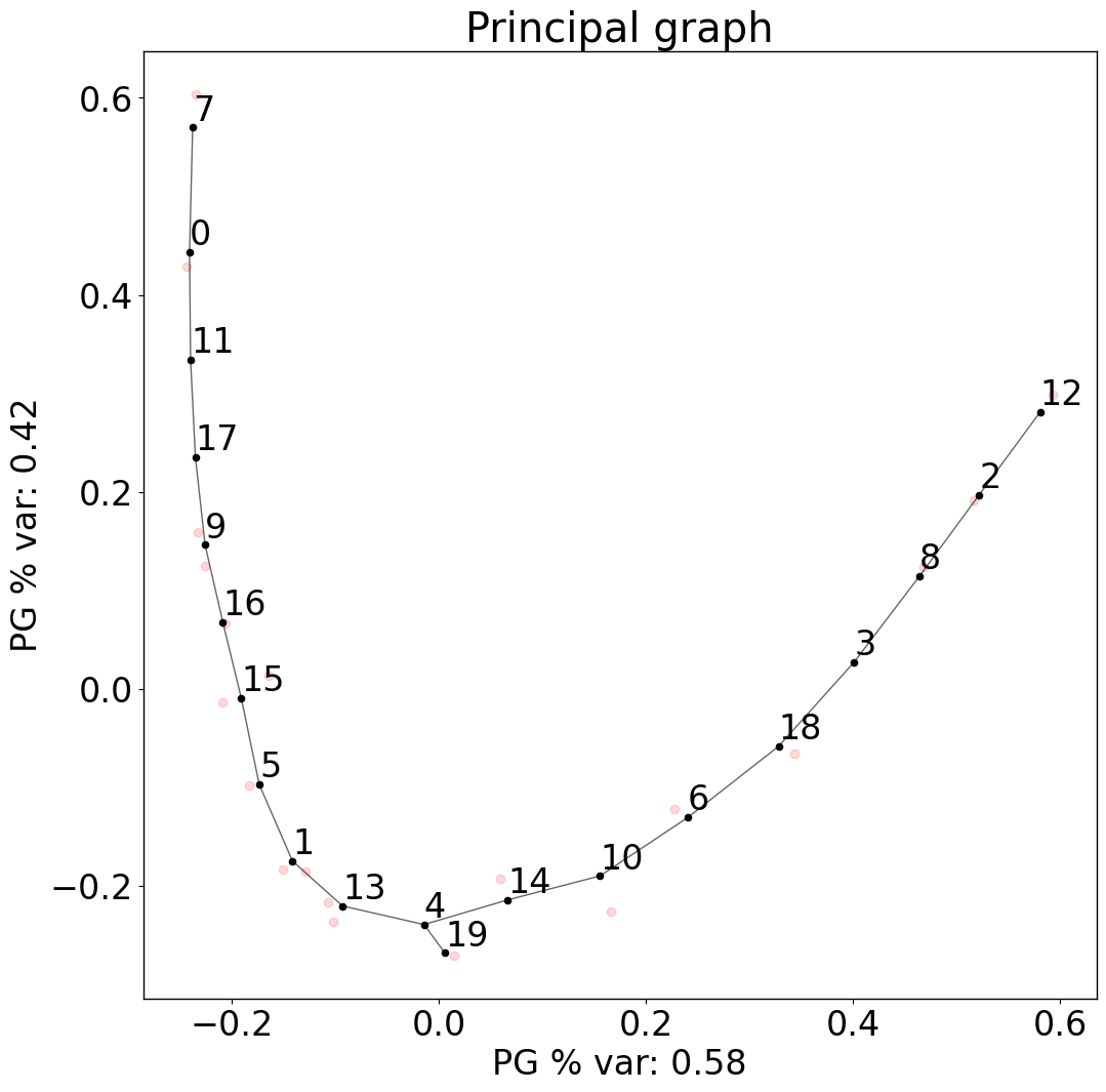
Trajectory:
pl.pl.trajectory(adata, colors = ['Blue','red'])
Fit a principal graph:
pl.pl.fit_pricipla_graph(adata, source_node = 7)
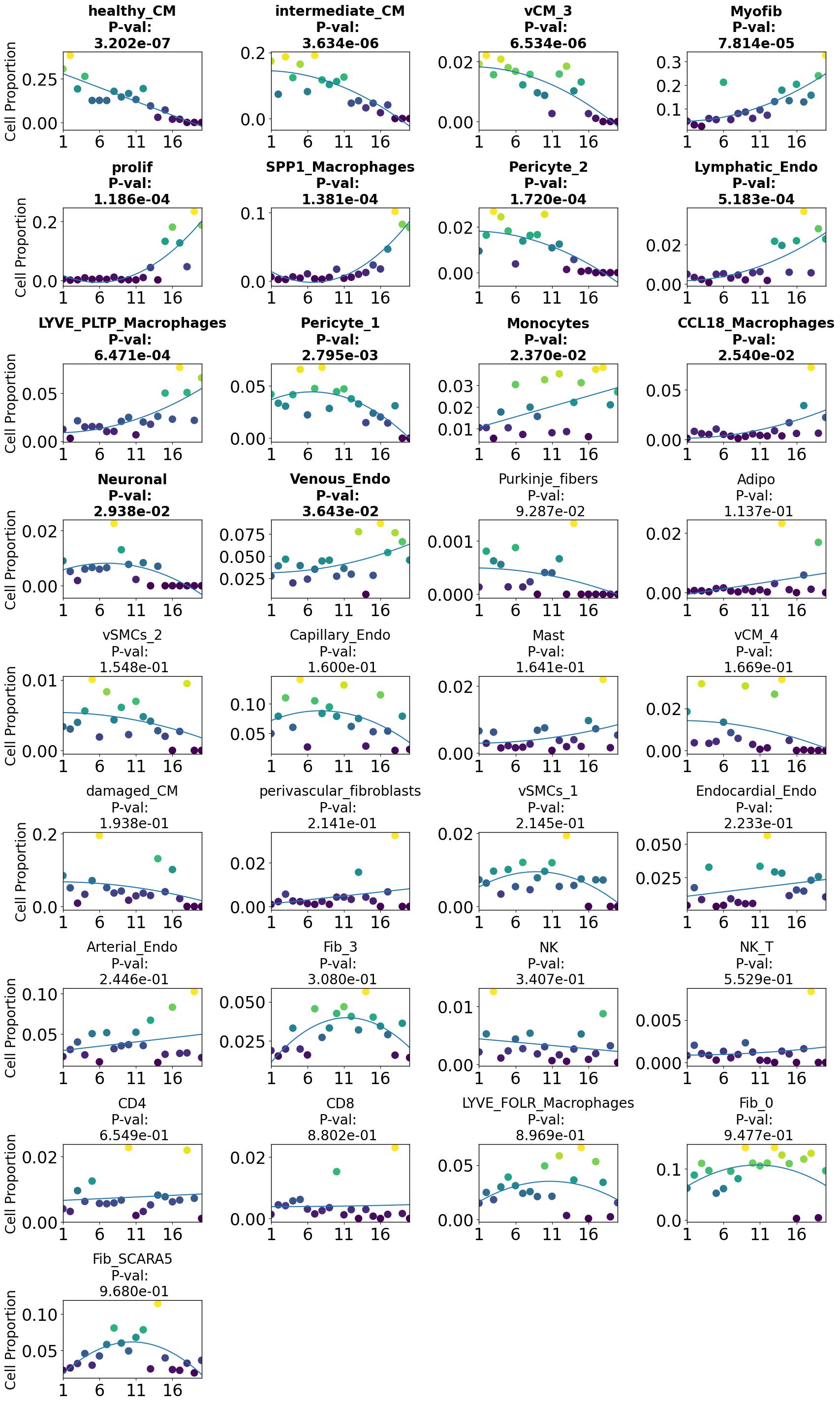
Cell-type importance:
pl.tl.cell_importance(adata)
Applying PILOT for finding Markers
Gene selection:
After running the command, you can find a folder named ‘Markers’ inside the ‘Results_PILOT’ folder. There, we will have a folder for each cell type. The file ‘Whole_expressions.csv’ contains all statistics associated with genes for that cell type.
Here, we run the genes_importance function for all cell types.
You need to set names of columns that show cell_types/clusters and Samples/Patients in your object.
Note that if you are running this step on a personal computer, this step might take time.
for cell in adata.uns['cellnames']:
    pl.tl.genes_importance(adata,
    name_cell = cell,
    sample_col = 'sampleID',
    col_cell = 'cell_subtype',
    plot_genes = False)
Cluster Specific Marker Changes:
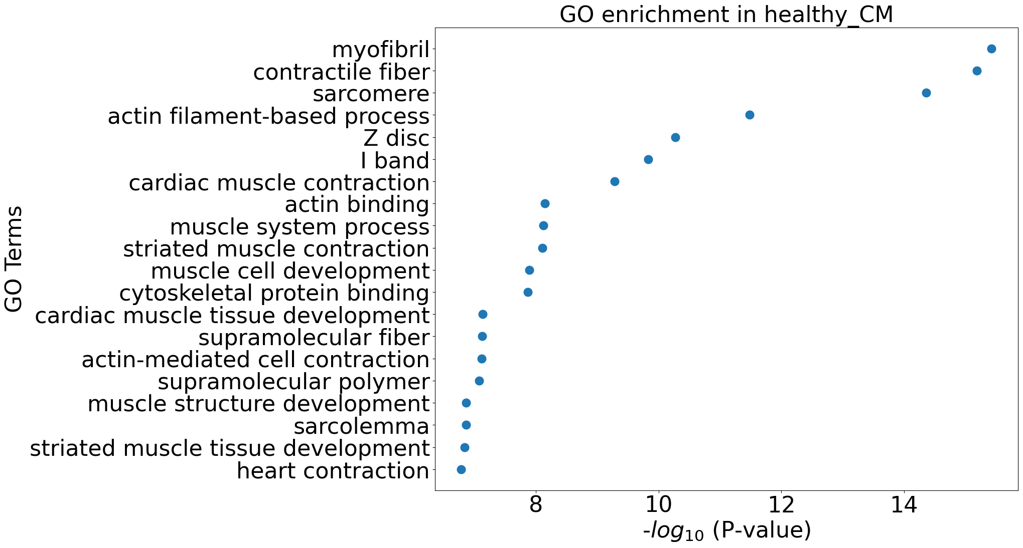
pl.tl.gene_cluster_differentiation(adata,cellnames = ['healthy_CM','Myofib'], number_genes = 70)
df = pl.tl.results_gene_cluster_differentiation(cluster_name = 'Myofib',).head(50)
df.head(15)
| gene | cluster | waldStat | pvalue | FC | Expression pattern | fit-pvalue | fit-mod-rsquared | |
|---|---|---|---|---|---|---|---|---|
| 2642 | GAS7 | Myofib | 212.477292 | 8.487275e-46 | 1.086644 | linear up quadratic down | 1.873033e-107 | 0.570704 |
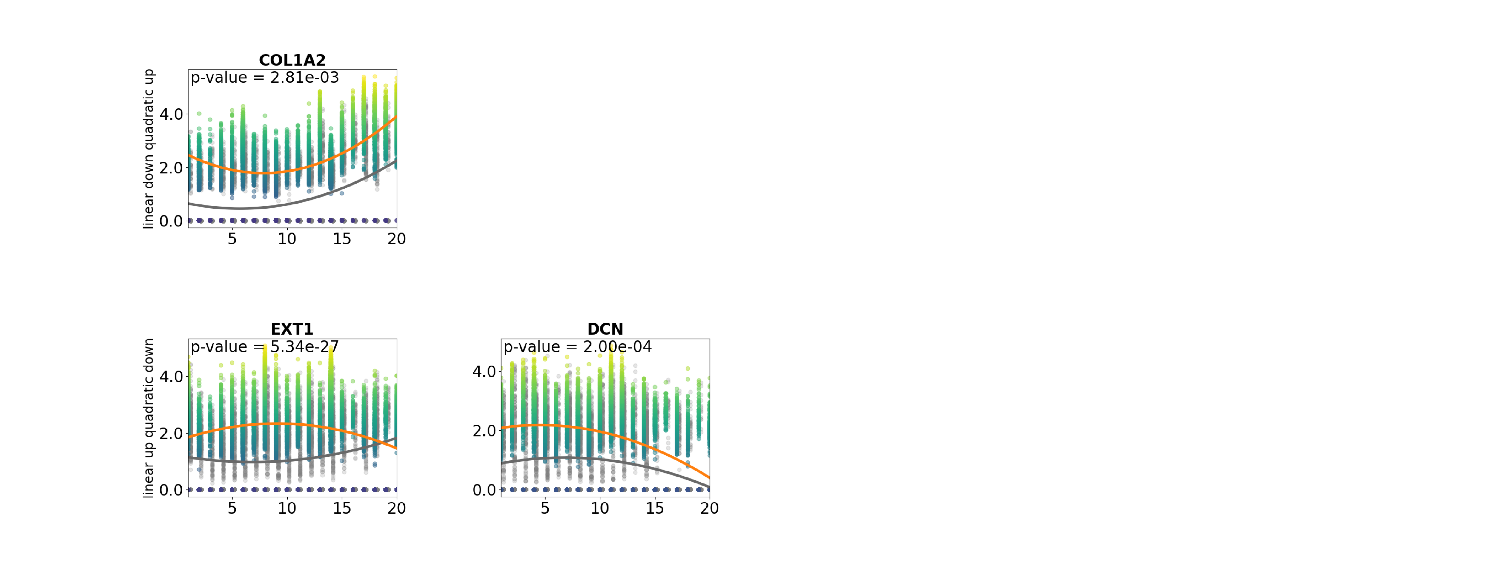
| 2151 | EXT1 | Myofib | 125.383128 | 5.344198e-27 | 0.786136 | linear up quadratic down | 3.159831e-35 | 0.555757 |
| 4979 | PKNOX2 | Myofib | 89.738712 | 2.492742e-19 | 0.855504 | quadratic down | 1.039404e-117 | 0.544122 |
| 2529 | FN1 | Myofib | 70.641696 | 3.110595e-15 | 1.573680 | linear down quadratic up | 2.947389e-188 | 0.633774 |
| 1437 | COL6A3 | Myofib | 54.751169 | 7.758841e-12 | 1.069156 | linear down quadratic up | 3.514298e-172 | 0.608543 |
| 5775 | RORA | Myofib | 52.486295 | 2.359167e-11 | 0.899459 | quadratic down | 7.232834e-174 | 0.587234 |
| 2832 | GXYLT2 | Myofib | 24.247113 | 2.218154e-05 | 2.000205 | linear up quadratic down | 2.402171e-85 | 0.537920 |
| 3783 | MGP | Myofib | 23.244418 | 3.591226e-05 | 0.871041 | quadratic down | 1.327779e-225 | 0.571374 |
| 4726 | PCDH9 | Myofib | 20.439646 | 1.376052e-04 | 0.604830 | linear down | 0.000000e+00 | 0.596035 |
| 1231 | CHD9 | Myofib | 20.389564 | 1.409364e-04 | 0.527488 | linear up quadratic down | 7.658862e-77 | 0.559604 |
| 1710 | DCN | Myofib | 19.656307 | 1.999818e-04 | 1.033697 | linear up quadratic down | 1.866152e-284 | 0.588602 |
| 2824 | GSN | Myofib | 18.015612 | 4.366007e-04 | 0.638136 | linear up quadratic down | 2.942472e-279 | 0.601684 |
| 1392 | COL3A1 | Myofib | 17.276479 | 6.199787e-04 | 1.240454 | linear down quadratic up | 0.000000e+00 | 0.665616 |
| 1372 | COL1A2 | Myofib | 14.068816 | 2.812963e-03 | 1.327753 | linear down quadratic up | 0.000000e+00 | 0.655032 |
| 7245 | VCAN | Myofib | 12.610158 | 5.560192e-03 | 0.838764 | linear down quadratic up | 1.761922e-164 | 0.571981 |
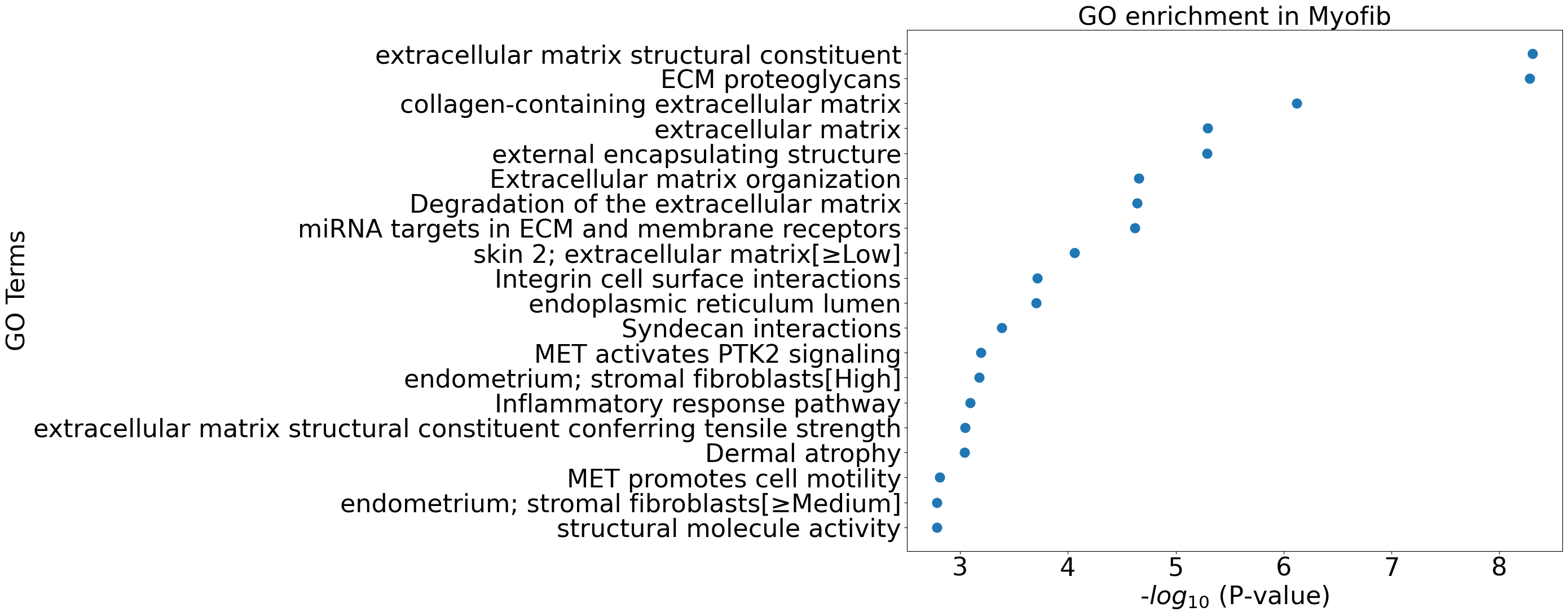
pl.pl.go_enrichment(df, cell_type = 'Myofib')
pl.pl.exploring_specific_genes(cluster_name = 'Myofib', gene_list = ['COL1A2','DCN','EXT1'])
df=pl.tl.results_gene_cluster_differentiation(cluster_name = 'healthy_CM').head(50)
df.head(15)
| gene | cluster | waldStat | pvalue | FC | Expression pattern | fit-pvalue | fit-mod-rsquared | |
|---|---|---|---|---|---|---|---|---|
| 6165 | SORBS1 | healthy_CM | 1574.665604 | 0.000000e+00 | 1.296470 | linear down quadratic up | 8.946560e-05 | 0.522953 |
| 1772 | DLG2 | healthy_CM | 1055.313030 | 1.801893e-228 | 1.155496 | linear down quadratic up | 1.323610e-256 | 0.556306 |
| 6733 | THSD4 | healthy_CM | 834.288239 | 1.583902e-180 | 1.671315 | linear down quadratic up | 6.088694e-250 | 0.582085 |
| 1276 | CMYA5 | healthy_CM | 752.301407 | 9.561746e-163 | 1.559703 | linear down quadratic up | 3.774063e-66 | 0.527869 |
| 3281 | LDB3 | healthy_CM | 542.239458 | 3.342198e-117 | 1.426196 | linear down quadratic up | 1.511694e-238 | 0.546327 |
| 36 | ABLIM1 | healthy_CM | 379.423867 | 6.335728e-82 | 0.979378 | linear up | 3.296026e-13 | 0.513734 |
| 6903 | TNNT2 | healthy_CM | 373.037957 | 1.530428e-80 | 1.392561 | linear down quadratic up | 2.329698e-118 | 0.535236 |
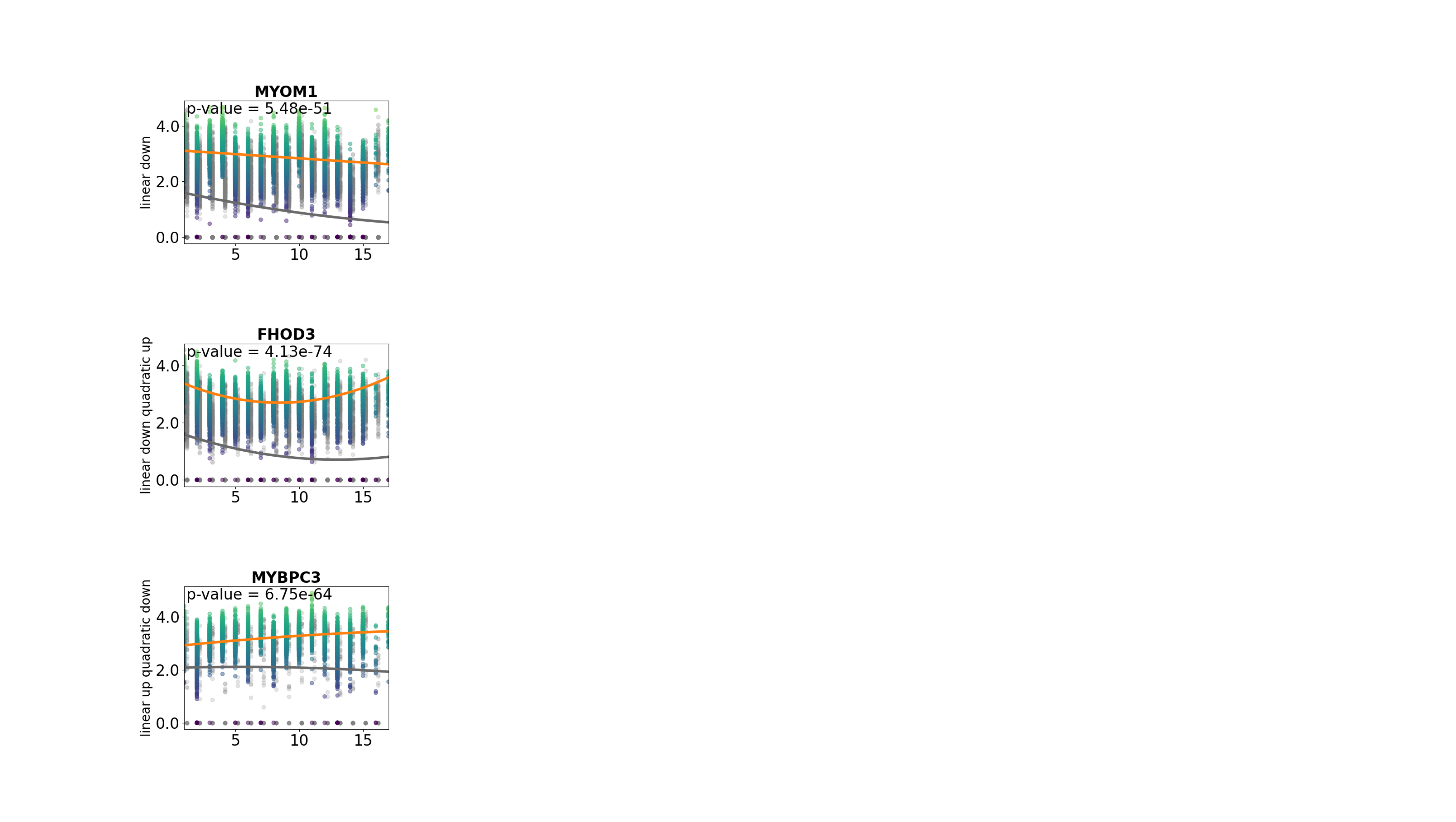
| 2398 | FHOD3 | healthy_CM | 343.341326 | 4.125161e-74 | 1.731741 | linear down quadratic up | 0.000000e+00 | 0.612758 |
| 6663 | TECRL | healthy_CM | 338.848075 | 3.875199e-73 | 1.261289 | linear up quadratic down | 0.000000e+00 | 0.570571 |
| 4056 | MYBPC3 | healthy_CM | 296.157297 | 6.751814e-64 | 0.686940 | linear up quadratic down | 0.000000e+00 | 0.557570 |
| 5652 | RCAN2 | healthy_CM | 287.996090 | 3.940736e-62 | 1.214055 | linear down quadratic up | 0.000000e+00 | 0.566313 |
| 1830 | DOCK3 | healthy_CM | 269.653643 | 3.667754e-58 | 0.534836 | linear down quadratic up | 2.678914e-202 | 0.527979 |
| 4177 | MYOM1 | healthy_CM | 236.482875 | 5.483541e-51 | 1.637375 | linear down | 1.381677e-268 | 0.548281 |
| 1915 | EFNA5 | healthy_CM | 236.263957 | 6.115035e-51 | 1.089847 | linear down | 1.127515e-164 | 0.532078 |
| 5436 | PXDNL | healthy_CM | 227.066418 | 5.957588e-49 | 1.284827 | linear down quadratic up | 1.815885e-03 | 0.518712 |
pl.pl.go_enrichment(df, cell_type = 'healthy_CM')
pl.pl.exploring_specific_genes(cluster_name = 'healthy_CM', gene_list = ['MYBPC3','MYOM1','FHOD3'])
Group genes by pattern:
You can find curves activities’ statistical scores that show the fold changes of the genes through disease progression in the ‘Markers‘ folder for each cell type separately.
The method used to compute curves activities had been inspired by Dictys project with Wang, L., et al. 2023 paper.
pl.pl.genes_selection_analysis(adata, 'healthy_CM', scaler_value = 0.6)


 No information for cluster 3!


In the table, you can check the curves activities of some genes of the healthy_CM:
Gene ID |
Expression pattern |
adjusted P-value |
R-squared |
mod_rsquared_adj |
Terminal_logFC |
Transient_logFC |
Switching_time |
area |
cluster |
|---|---|---|---|---|---|---|---|---|---|
GRXCR2 |
linear down quadratic up |
0.00 |
0.29 |
0.65 |
-0.02 |
-1.8 |
0.03 |
59.63 |
4 |
SEMA5A |
linear down quadratic up |
0.00 |
0.25 |
0.63 |
-0.12 |
-0.82 |
0.1 |
48.83 |
2 |
PRKG1 |
linear down quadratic down |
0.00 |
0.19 |
0.61 |
-0.19 |
-0.01 |
0.62 |
10.97 |
1 |
FHOD3 |
linear down quadratic up |
0.00 |
0.19 |
0.61 |
0.01 |
-2.06 |
0.97 |
64.71 |
4 |
L3MBTL4 |
linear down quadratic up |
0.00 |
0.19 |
0.6 |
-0.05 |
-1.51 |
0.04 |
56.02 |
4 |
… |
… |
… |
… |
… |
… |
… |
… |
||
SNHG25 |
linear down |
0.00 |
-0.29 |
0.36 |
-0.2 |
0 |
0.51 |
0.71 |
2 |
BAG3 |
linear down |
0.00 |
-0.3 |
0.35 |
-0.21 |
0 |
0.5 |
0.27 |
2 |
ATP6V1C1 |
linear down |
0.02 |
-0.3 |
0.35 |
-0.2 |
0 |
0.5 |
0.31 |
2 |
SDC4 |
quadratic up |
0.00 |
-0.31 |
0.35 |
0.2 |
0 |
0.64 |
13.74 |
5 |
ZNF490 |
linear down |
0.00 |
-0.31 |
0.35 |
-0.2 |
0 |
0.49 |
0.65 |
2 |
The complete table can be found here: healthy_CM_curves_activities.csv
pl.pl.genes_selection_analysis(adata, 'Myofib', scaler_value = 0.5)


 No information for cluster 3!

In the table, you can check the curves activities of some genes of the Myofib:
Gene ID |
Expression pattern |
adjusted P-value |
R-squared |
mod_rsquared_adj |
Terminal_logFC |
Transient_logFC |
Switching_time |
area |
cluster |
|---|---|---|---|---|---|---|---|---|---|
LAMA2 |
linear up quadratic down |
0.00 |
0.38 |
0.74 |
-0.15 |
0.05 |
0.76 |
28.73 |
2 |
COL1A1 |
linear down quadratic up |
0.00 |
0.31 |
0.68 |
0.14 |
-0.39 |
0.86 |
48.08 |
1 |
NEGR1 |
quadratic down |
0.00 |
0.28 |
0.67 |
-0.17 |
0 |
0.64 |
16.17 |
2 |
COL3A1 |
linear down quadratic up |
0.00 |
0.28 |
0.67 |
0.12 |
-0.63 |
0.89 |
54.59 |
1 |
ZBTB20 |
linear up quadratic down |
0.00 |
0.27 |
0.68 |
-0.15 |
0.08 |
0.77 |
30.9 |
2 |
… |
… |
… |
… |
… |
… |
… |
… |
||
MAN2A1 |
quadratic down |
0.00 |
-0.35 |
0.40 |
-0.17 |
0 |
0.65 |
17.56 |
2 |
ADGRD1 |
linear down |
0.00 |
-0.36 |
0.42 |
-0.17 |
0 |
0.49 |
1.45 |
4 |
ATR |
quadratic down |
0.00 |
-0.36 |
0.39 |
-0.17 |
0 |
0.65 |
17.71 |
2 |
URI1 |
quadratic down |
0.00 |
-0.36 |
0.39 |
-0.17 |
0 |
0.65 |
17.49 |
2 |
TRA2A |
quadratic down |
0.01 |
-0.39 |
0.38 |
-0.17 |
0 |
0.65 |
17.01 |
2 |
The complete table can be found here: Myofib_curves_activities.csv
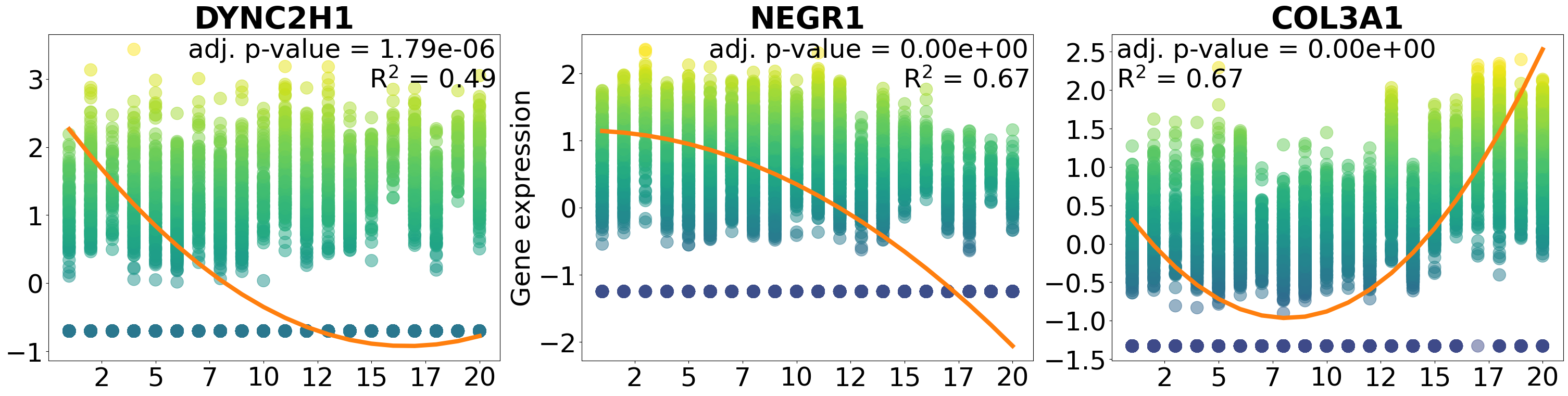
Plot specific genes:
pl.pl.plot_gene_list_pattern(['DYNC2H1', 'NEGR1', 'COL3A1'], 'Myofib')